Although the old switchboard was a good idea in principle, it was horrible and very limiting to use in practice & I was very pleased to see it disappear
My own take on a switchboard or main menu form has been in use in various apps for over 15 years. In one large app, it consists of 3 sections
a) 20 toggle button main options in the centre column
b) 20 toggle sub options in the right column whose captions / actions depend on the main option selected
c) a further set of 6 'stand alone' toggle buttons on the left that aren't part of the main set of options
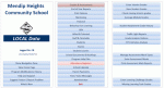
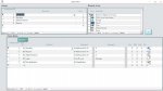
This 'low-res' screenshot shows one of the main options and its sub option menu
in the above screenshot, the top main option 'Grades & Assessments' has been selected & its suboptions displayed
The 'Attendance Registers' button is highlighted as the mouse is currently over that button. Mouse move code is used to explain its purpose in a label at the bottom of the form (not shown here)
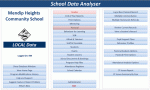
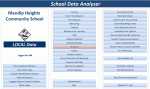
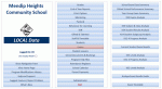
Further screenshots are attached for other main option menus
Taking all possible combinations into account, this gives a total of up to 406 options available from one main form.
In practice there are about 250 in use at the moment with unused options being hidden in each menu.
Depending on user status, some buttons in each section may be hidden or have different captions/actions.
Mouse move code is used for all buttons to give additional details about what each item is used for.
I don't use images or multiple colours for the buttons as in my opinion this would be distracting
One huge advantage about this approach is it is reuseable in different apps.
In the same app, an admin menu form also uses exactly the same layout / type of code
 menu.png70.5 KB · Views: 195