I am curious to see the kinds of graphics that other people put in their forms and reports. Over the years I have put volcanoes, racetracks, gauges, and images of planets and the moon into my forms and reports.
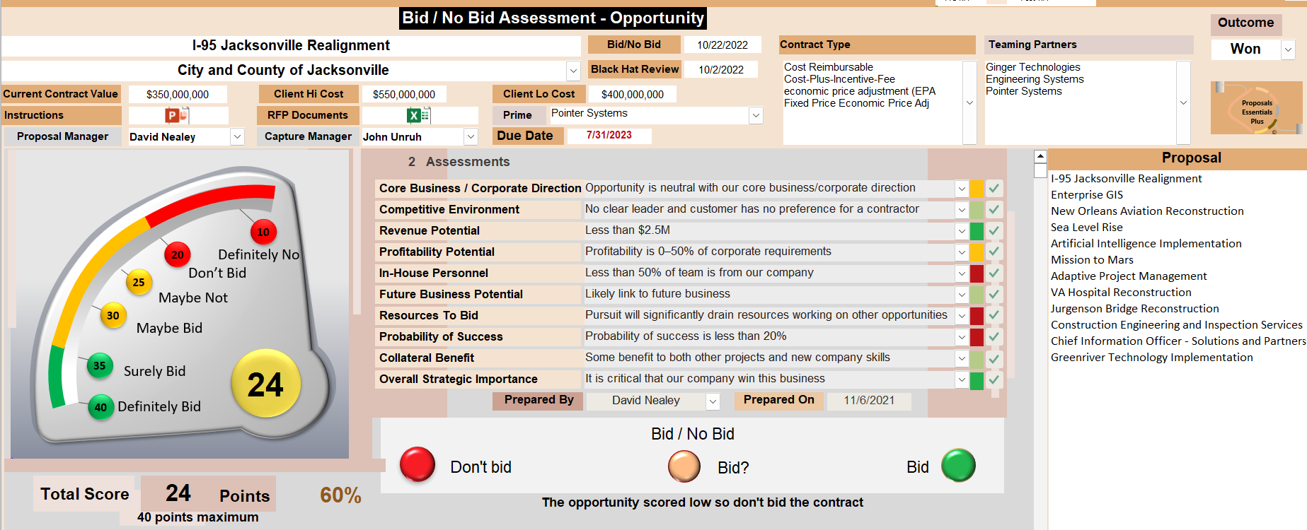
One of my favorites is this gauge. The numbers are calculated using a five-level Likert scale. The code uses the .Visible method. The code is very simple.
The statements in the middle of the screenshot control the colors of the squares. The squares use conditional formatting.
I created the gauge in PowerPoint and pasted it into the Access form.
Two of the text boxes are multi-value fields. They are used to ensure consistency.
The checkboxes open forms that tell the user what the statements may mean to the business.
This form also reads the scores aloud. Many of my forms and reports use speech.
This was one of my earliest forms with a graphic so it is crude.
