Solved Prevent user from activating a form

Mike Krailo

Well-known member
Local time
Today, 07:36
Joined
Mar 28, 2020
Messages
1,341
This is kind of a puzzle in that, I know that this must be possible because I seen another talented developer create a form like this. In fact, this is my attempt at duplicating one of his modern looking forms. If you look at the screen shot you can probably surmise that this form is actually made up of three different forms that are borderless. The two lighter colored forms are on top of the blue form which makes a nice looking tab like effect in the upper left corner. Everything works and looks great as long as the user doesn't click any part of the blue form and this pops it on top of the others which of course I don't want. So far the only solution I could muster up is to simply re-open the other two forms in the label and details on click event. This does work except that you can still see the blue form visually pop up and go back under which again is undesirable. Does anyone know of a way to prevent the user from effectively clicking on the blue form or otherwise prevent the visual anomaly from occurring?
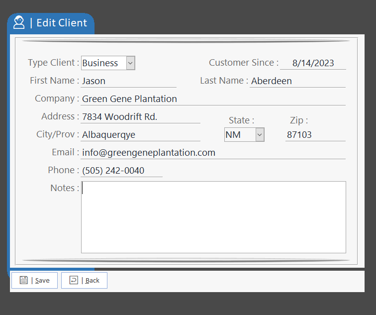
1692071855334.png
 
Last edited:
Why does the blue form need to be the height of the other two forms?
Why don't you put the two lighter forms on another form?
 
Why does the blue form need to be the height of the other two forms?
That's the challenge at hand. It needs to be that height to make the form appear like the original design that I witnessed working. I was impressed on how it looked and now attempting to recreate the whole effect.

Why don't you put the two lighter forms on another form?
This actually gives me an idea that just might solve this and some other problems as well. I'll try it out and let you know how it goes.
 
Darn, I thought I might be able to somehow make an underlying form that had it's opacity set to zero while the objects on top of it remained visible but It doesn't seem to be possible, at least I don't see a way to do that. So while I have gotten close to a solution, it doesn't quite cross the finish line.

Here is the pic of my last attempt to put everything on one form and change the opacity on the main form. That's not going to work.

1692104511614.png


Here is the form that I got my inspiration to work this up from. His name is Jose Roberto Moraes and he has a lot of still shots of some of his design work that looks pretty impressive. Check it out in action HERE.

1692104850662.png
 
So make a TAB control and embed the actual form(s) in it as sub-forms. Then it doesn't matter if someone clicks the tab. And if the form holding the TAB control has no other controls on it, clicking the background that is exposed to the right of the exposed TAB does nothing because there is nothing to "bring to front."
 
Collin, that definitely is on the right track except the blue form won't popup through the maximized main form now. Even if it isn't maximized, the blue form won't rise up over the main form that has the button that launches these four forms. One of the forms is a transparent form giving the overall effect of prompting the user to work with this popup form only.

So it's really close to working as intended (except one other unmentioned issue) but I'll deal with that later.
 
I can do that later on, I have been called into work early so I have to drop the ball for now.
 
I'm confused.
In post #1 you said you didn't want the blue 'tab' form to appear on top. Then in post #7 you said that using popups means the blue won't ever rise to the top. So, which do you want?

Anyway, this effect can be achieved using just one form with transparency which makes the top right section invisible.
For some examples, see The Animation, Transparency and Fade section of this example database
 
I'm confused.
In post #1 you said you didn't want the blue 'tab' form to appear on top. Then in post #7 you said that using popups means the blue won't ever rise to the top. So, which do you want?
Sorry about the confusion. The blue form has to pop up to almost the same level as the two lighter forms but there are two more forms involved. One is a transparent form and the other is the main form from which these four are all launched from. When popup is set to NO, then it does not go up high enough in the z-order to over come the transparent form which has to be set to popup and the main form itself.

Check out the demo attached. The frmMain form will launch maximized and just click the Edit Client button. It all appears to work but clicking on the blue form still has an annoying effect of popping up over the two lighter forms.
 

Attachments

I suspect the author of that video would have same issue if user clicked on the blue "tab" form. Since the video isn't about how that structure was designed, can't verify. Again, why don't you just modify and reduce the blue form to size of the tab?
 
I may end up contacting him directly and ask him about this particular issue. I'm hoping there really is a better solution to this. I still need to look over what Collin pointed in post #10.

Wait a minute, I just realized a way to make this work, but it is getting kind of out of hand. I'm thinking instead of using one blue form, just break it into three parts. That would prevent the z-order problem. Lot of work for getting the effect, but it seems like it would work. Now if there was a way to make it look like this on one single form, then that would be the perfect solution. So I'm going to look at the stuff Collin is mentioning to see if there is anything there to help.

Update:
Well I just tried my new idea and that won't work due to minimum width on forms. Thought that was going to work. It does look very nice even with the single tab on the top so that's a good fall back.
 
Last edited:
I like experimenting with user interfaces and will put in a lot of time where I think it adds something new or better.
However, whilst this looks good, it does seem to be a lot of effort for little real benefit that I can see.

BTW Did you provide any method of exiting your example db? Vital in cases where full screen mode is used.
If so, I missed it and had to change to design view in order to escape.
 
I thought all the forms had back button or exit button options. Also right click and close still works as well. Your right this one is taxing my brain as to how it was done. If using one simple popup form set to modal, then you cannot click on anything else including that transparent form. But in this case, I could not use modal on the main form because then you would never be able to click the Save or Back button. Catch 22. So I'm probably going to contact Jose and see what he can enlighten me about these issues. At this point, it's more of a challenge to discover a way to make it work, so I'll keep perusing a solution.
 
I was testing on my tablet and the Back button didn't work on the Main form.
It does on my desktop PC
Nor does the Exit button work on the Button form and the right click Close menu item is disabled!

Jose often publishes screenshots of his form designs at various forums but, from memory, he doesn't respond to questions about how his forms are created.
Hopefully you'll get a response by contacting him direct
 
Jose did confirm that his form as noted and all of his popup forms are just one single form. So that means there is some way to make the very bottom (lowest z-order) background of the form transparent only. After reviewing the code in Collins demo, I think I see how those transparency command work now. As soon as I have a chance to test it out, I will experiment with it, but it does now look possible to do this effect rather easily once you know the secret. You can exclude one particular color just like a green screen works. So setting the background color of the detail section to vbMagenta or some other color you know does not exist in the form itself will make it possible to do the given effect Jose created. So thanks for that demo showing how it works.

So what I did in post #4 was actually the right way to do it. Just didn't know how that API worked at the time.
 
Transparency isn't difficult once you have the code to implement it. Hopefully you can get it to work from my example
 
Transparency isn't difficult once you have the code to implement it. Hopefully you can get it to work from my example
I got it to work exactly like I wanted. So this whole thing is super easy once you have the API's and know how to use them. It was fun learning about this and I can see how in certain circumstances, this type effect can make a form stand out from the norm. Thanks again Collin.
 
Good to hear it’s working for you.
As you say it’s a way of getting a form to stand out. In my opinion the effect should be used sparingly, just like rounded corners. If used too often, nothing stands out
 

Users who are viewing this thread

Back
Top Bottom