Visualising of machine status/log

Bieke

Member
Local time
Today, 21:47
Joined
Nov 24, 2017
Messages
78
Hello,

I want to visualize the statuslog of production machines.
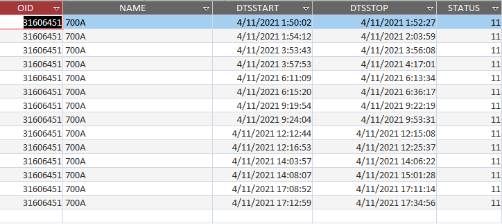
I have a table with data form the run/stop times of 40 machines.
1639723227513.png


Field : NAME = Machine name (only one machine is selected)
Field : DTSSTART is the field with the starttime of the disturbance.
Filed : DTSSTOP is the field with the stoptime of the disturbance.
The runtime of the machine is the time between the DTSSTOP from the first record until the DTSSTART of the next record.
In this case the machine was stoped at 1:50:02 until 1:52:27 (2,5 minute) and then runs from 1:52:27 until the next disburbance 1:54:12 (+/-2 minutes)
Now i want to visualize al 40 machines on one page with i timeline where stop-periodes are colored in Red and run-periodes colored in black.
Example of 1 line for machine 700A :
1639723831393.png

The lenght of this line must be over a periode of 24h.
I tried to do this with rectangles where the width of this rectangle dependes on the duration of the stop/run time but the maximum of fields in a form is 256.

My question :
Is there a posibility to do this an other way? (not adding rectangles after each other)

Thanks in advance,
Bieke.
 

Attachments

  • 1639724030529.png
    1639724030529.png
    998 bytes · Views: 303
All 40 machines on one line?
Couldn't there be hundreds of stop/start records for 1 machine?
I don't see a way to do this for even one machine.
 
you can use a Crosstab, though.
the "missing" minutes from your data will be "filled" in using
a Cartesian query (cross-join).

on second thought only 255 columns (?) can be outputted from a query.

the other option is "put" the (24 hrs) data in excel, then save the data as Picture.
save the picture to disk and use the image in your form/report.
 
All 40 machines on one line?
Couldn't there be hundreds of stop/start records for 1 machine?
I don't see a way to do this for even one machine.
I can spread it in 2 pages. It is indeed possible that there are more than 100 start/stop per 24H.
I tought maybe ther is a possibility to setup fragments in a rectangle object or a picture that i can write the pixels to?
 
you can use a Crosstab, though.
the "missing" minutes from your data will be "filled" in using
a Cartesian query (cross-join).

on second thought only 255 columns (?) can be outputted from a query.

the other option is "put" the (24 hrs) data in excel, then save the data as Picture.
save the picture to disk and use the image in your form/report.
Your proposal to do this in excel, it it not possible to have different column width over more rows i think.
Can you make an example of such an excel sheet to explane?

Thanks,

Bieke
 
you can simplify your image by having a single dark box for the total timeline and overlay the stop times over the top (suggest remove borders). Or consider using a line control with (the maximum) borderwidth of 6 points

The minimum width a line is 1 pixel=15 twips.

Say the minimum disturbance period you want to display is rounded to 1 minute (anything less shows as 1 minute)- there are 1440 minutes in a 24 hour period, so the width of your dark time bar would need to be 1440*15=21600 twips to display the stop times accurately - around 15 inches or 38cm

As for number of stop events for any machine over a 24 hour period, that is for you to judge, A form has a lifetime total of over 700 controls (can't remember the exact number). Set those controls left, top, height and width to 0 and for each stop time determine the position of each control, surplus controls remain hidden

then have 40 subforms, one for each machine, you can hide borders
 
This is definitely daoble as @CJ_London says with 40 subforms. I have done a very similar thing exporting to Excel for reliability analysis, if that is an option. The image you show can be done in 6 textboxes. 1 for the background and 5 for down periods. So I assume 50 max down periods a day. that is pretty easy to make 50 hidden textboxes txtDown1 to txtDown50. However I would build a lot of my form by code so I am not manually making all those hidden textboxes. If you want a few hundred then that is not problem. When the subform loads it sizes and places the down period boxes over the black "Up line" in the correct place. As CJ_says make only the used ones visible.

However, 40 subforms would still be kind of a pain on one form. It would be a lot easier to have says 10 machines per page and then scroll each group of ten.

This idea is somewhat similar

This is created using excel by exporting the time data from Access. The code was written in Excel to build based on time data export from Access. These different periods are created using the time status with more than 2 statuses than just simple up and down.
status.jpg
 
Last edited:
If you can post a table with some data for a day, I will see If I can demo a graph. Include at least a few different machines. How many Max disturbance periods do you expect? I see a status block. Do you have different types of disturbances? Would you want different colors like I have depending on the status?
 
For me, I would use a function to parse the recordset for a machine and return an comma separated array providing the stop start data in twips and called from your form recordsource.

Some years ago I developed the equivalent of the Excel sparklines feature (which summarises row data such as sales by month in a small graph on each row) for access forms and reports. It's not really useable here, but if you provide some data as MajP has requested I can see if I can modify it to generate the type of report you require.

Edit: just googled to see if anyone else had done something similar - found this but for reports only - which you could display as a subreport on your form
Haven't looked at the code but you might be able to adapt it
 
Last edited:
Hello MajP, thanks for helping me out.
This example looks very helpful to me.
If you can help me with a demo a graph that would be very nice.
Find attached a table with the disturbance data from a few machines.
Thanks in advance.
Bieke
 

Attachments

demo of your virtualization.
put all in same folder.
 

Attachments

Thank u CJ_London, every data and examples are welcome.

Regards Bieke.
 
this is my 'offering' - result
1639790703852.png


I've allowed for a maximum of 40 stops and 12 machines, to extend stops, simply add more lines ensuring they maintain a numerical order and similarly for machines add more textboxes and subforms.

Per my original comments on granularity, the time line represents 1440 minutes and a stop of less than a minute is treated as 1 minute so you should see every stop
 

Attachments

Last edited:
just another "flavor".
you can double-click on the visualization chart (any record), and it will
show you the details on a pop-up form.
 

Attachments

I've allowed for a maximum of 40 stops and 12 machines
looks good, but the graphs are somewhat the same?
especially 660J-2K, which only has 1 record.
 
just another "flavor".
you can double-click on the visualization chart (any record), and it will
show you the details on a pop-up form.
Very nice feature, i'm going to complete it with all machines and i will post the result.
Thank u fery much, it is a great help.

Bieke
 
just another "flavor".
you can double-click on the visualization chart (any record), and it will
show you the details on a pop-up form.
Very nice feature, i'm going to complete it with all machines and i will post the result.
Thank u fery much, it is a great help.

Bieke
Oops! it was late, needed to reset the stop controls - updated
View attachment 96938
Now it's better CJ, i appreciate you are working that late for me :). I will test it. I learned a lot from this.
Thanks i could not do it without you guys. Top !!!
 
just another "flavor".
you can double-click on the visualization chart (any record), and it will
show you the details on a pop-up form.
Hello arnelgp, is it also possible to generate a line chart when you double click on a record?
 

Users who are viewing this thread

Back
Top Bottom