Hi everyone, I'm new here and registered because I have this specific issue and could do with some advice.
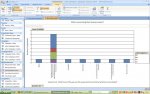
How can I get the category axis of a pivot-chart to display 'properly' when the field I have placed in it accepts multiple values from a list. I can illustrate my problem with a screen-shot (attached to this thread).
I am setting up a business as a commercial photographer, and this chart is part of my market-research which is an essential part of my business plan (which in turn is essential in my application for a grant). It shows the responses to a question which asked potential customers in which months their promotional activities take place (the chart type is a stacked column and the series values represent different market sectors, retail, manufacturing etc.).
The answers to this question are contained in a text field 'Question 3b*', which looks-up values in a list of all 12 months. Many respondents' promotional activity takes place in multiple months and so the field needs to accept multiple values. 'MRQID' is the primary key for the table that contains questionnaire responses.
I'm sure it's fairly obvious now what I want the axis to look like, and you can see my problem from the screenshot. Instead of the axis comprising of the months January through December, with each bar showing how many respondents checked that month in their answer; it shows how many respondents checked each combination of months. One column for 'April and March' and a different column for 'April and October' etc.
Any help or advice would be greatly appreciated. Thanks in advance.
Will.
Attachments
Last edited: