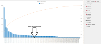
Pareto Graphic

Hello Colin:
My first impression was >> Great
I activated the Beta channel and version 2412 appears, with the "Pareto" item
In a later analysis I saw that the representation was not correct.
1.- On the Y1 Axis there should be the values of >> VtaporProd
2.- On the Y2 Axis there should be the Values of >> Pct100 and of course they cannot start at (0), zero.
The first value must be 15.8 since the first product represents 15.8% of the Total sales.
3.- On the X Axis the numbers of the IdProducto should appear, ordered from highest to lowest sales,,and some strange values appear.
I attach an image of what it should be.
1731765868288.png

Regards >> Jacinto
 
Last edited:
Hi Colin again:
Doing tests, the closest I have managed to get is the graph that I attached in a .png file.
The main problem that I see is that it does not allow each series to be projected on a specific axis.
Greetings again >> Jacinto
 

Attachments

  • ParetoBad.png
    ParetoBad.png
    162.4 KB · Views: 23
My first attempt was incorrect.
I've done it again and it now looks OK to me:

1731773257836.png


The numbers on the x-axis are the % values

Here's another example with my own data:

1731773303032.png

Its possible to include more than one series on the same chart but I think doing that makes the chart difficult to understand

1731772803387.png


All examples included in the attached db.
 

Attachments

Last edited:
Colin:I had taken a wrong path when building the Pareto chart.
I had an "AutoNumber" as the ProductID and it seems that it doesn't support it properly.
After several attempts and seeing your chart, I have corrected my operation.
I have converted the First field into a string and the result is perfect.
I haven't seen how to change the thickness of the Pareto line,
I don't know if there is a way or if it is not possible.
It would be good to have that option.
In case it is of interest to any other user, I have built a Menu to see the types of chart including the incorrect one.
If it is useful, great.Attached BD.
Again, a cordial greeting >> Jacinto
 

Attachments

I was slightly thrown by your new chart having far fewer data points . . .

Anyway, glad you're now happy.
You should also be very pleased to have been solely responsible for a new Access feature.
I had never heard of Pareto charts until your post on 18 Oct
Less than 1 month later, its now been added as an Access Modern Chart

Unfortunately, it isn't currently possible to change the width of any lines in Access modern charts.
However, it would be very useful!
 
I have reduced the number of products for better visualization, but in the attached database I include the number of 77 products.
I think we can be happy.
I pointed this out, but if I had made the request to Microsoft, they would have paid little attention to me.
Your intervention was really decisive.
The important thing is that in the end it is there and you have been able to verify its usefulness.
Thank you for your management >>> Jacinto
Translation made with Google
 

Attachments

Users who are viewing this thread

Back
Top Bottom