Pivot Chart for report (1 Viewer)

chriscardwell06

Registered User.
Local time
Today, 15:42
Joined
Aug 18, 2011
Messages
38
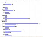
We have a chart that is showing jobs by customer. I'd prefer it be in a pie chart but it's way too many to read. We changed it to a bar which is much easier to read but it displays the percentages as 100% for everything. I cannot figure out how to change it. Can someone please help me with this?
 

Attachments

  • Untitled.jpg
    Untitled.jpg
    97.1 KB · Views: 68

Big Pat

Registered User.
Local time
Today, 20:42
Joined
Sep 29, 2004
Messages
555
Everything's 100% yet the bars are all of different length? That is strange. I could be wrong about this but I think you might have selected a 100% stacked bar chart. If so, it's worth trying the following:

Design view > right-click chart > Chart object > Edit
Right-click chart again > Chart type
Now select the first chart type i.e. the "standard" bar chart.

Click off the chart and view your form/report. Any better?
 

chriscardwell06

Registered User.
Local time
Today, 15:42
Joined
Aug 18, 2011
Messages
38
I just checked that and I am using the very first one. It's called cluster bar chart. I even tried the others to see and the output didn't change the number at all.
 

Big Pat

Registered User.
Local time
Today, 20:42
Joined
Sep 29, 2004
Messages
555
Did you create it as a pie-chart first and then change it? If so, it sounds like something went wrong there and you might be better off starting over with the chart wizard.

It would also help to know a bit more about your data, because I don't understand why everything is 100%. Can you post a sample of your data i.e. the final query or table that your chart is based on? That might help me get my head around it.

See also the jpeg I've attached. This is from one of my recent databases, counting the number of patients in clinical trials at various centres. Is this the kind of chart you need?
 

Attachments

  • chart.JPG
    chart.JPG
    43.3 KB · Views: 76

chriscardwell06

Registered User.
Local time
Today, 15:42
Joined
Aug 18, 2011
Messages
38
I'm not sure how to post it. The main table is in a single file and all the other queries and reports are in a satellite file. I did make it a pie chart at first. But there was so much data you couldn't read it. I can make it show the count. But my boss wants to see it in terms of percentage vs the overall total. I can try it again from scratch and see if that changes it. If you can tell me how to post that date I will but I wasn't sure with the 2 different files.
 

Big Pat

Registered User.
Local time
Today, 20:42
Joined
Sep 29, 2004
Messages
555
OK, I see the problem. You relied on the pie-chart to "provide" the percentages which it does quite nicely because it knows everything must add up to 100%. In a bar-chart, it doesn't know that there won't be more data, so it won't calculate the percentage for you. See attached screenshots of simple pie and bar charts in Excel. percentage option does not even exist on a bar chart.

So you need to calculate the percentage in the query first and then base your chart on that calculated column. There may be a way to do this all in one query, but I prefer to break things up into simple steps. It just helps keep me organised.

I hope the attached sample database will help. Check out the three queries. Numbers 1 and 2 could be the other way round that makes no difference, the crucial thing is that you need both a count for each category (customer/colour) and the overall count. Then you need to calculate the %s and base your charts on that.

Let me know how you get on.
 

Attachments

  • chart options.JPG
    chart options.JPG
    64.9 KB · Views: 72
  • Example.zip
    16.1 KB · Views: 72

Users who are viewing this thread

Top Bottom