Welcome to the new AWF home page! (1 Viewer)

Jon

Access World Site Owner
Staff member
Local time
Today, 13:43
Today, I plan on launching the updated home page here at AWF. The current one is very dated and serves no real purpose. So, over the last week or so, I've been messing around with different ideas, formatting, improving my WordPress Guttenberg block skills (a new way of doing WordPress sites), setting up a local WordPress server on my iMac for development purposes, getting GDPR legal docs and editing those, deciding on what menus to have, brainstorming ideas for this part of the site, creating a new About page, trying to make things line up on the site when they refuse to line up, getting testimonials and other nonsense.

Access World Forums has turned into a purely altruistic endeavour, funded by advertising and maintained by a combination of:

a) Site admin (me)
b) Moderators, both present and past
c) Helpful members
d) Newcomers
e) Trolls

As a team, we have a great community here. Many members know one another for countless years and great social bonds have been created. It is a safe haven away from the Facebooks of the world. Long may it all continue.

For posterities sake, I will post below a screenshot of the current site home page.
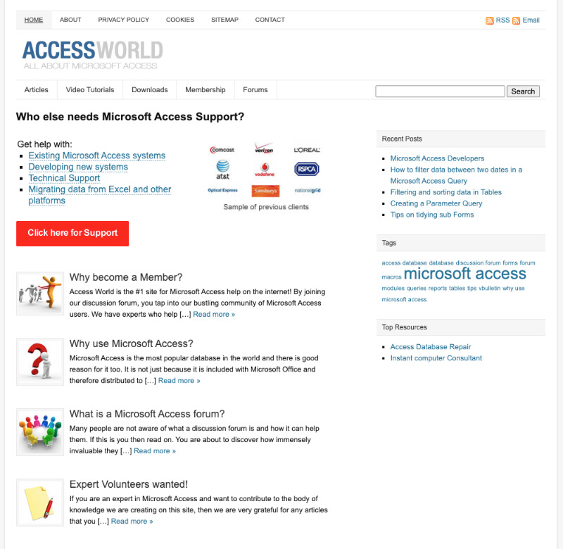
1596801475811.png
 

Jon

Access World Site Owner
Staff member
Local time
Today, 13:43
New homepage, now live. At last! Let me know what you think. Suggestions welcome for the homepage and all parts of the site.

I will be adding the privacy details soon.
 

Minty

AWF VIP
Local time
Today, 13:43
Look very nice @Jon , A much more modern feel.

The visit forums button doesn't currently work though?
 
  • Like
Reactions: Jon

Jon

Access World Site Owner
Staff member
Local time
Today, 13:43
Thanks @Minty. Yes, I found that out on upload. Just fixed it.
 

Jon

Access World Site Owner
Staff member
Local time
Today, 13:43
I've just increased the size of the "Visit the forums!" button. It looked too small.
 

Jon

Access World Site Owner
Staff member
Local time
Today, 13:43
Thanks @jdraw. It would be nice if I could make that part of the site more useful, like with articles, good resources etc.
 

Jon

Access World Site Owner
Staff member
Local time
Today, 13:43
Thanks @AccessBlaster. I've checked out what it looks like on mobile and its rubbish. I will have to create two versions of the home page: desktop and mobile.
 

Micron

AWF VIP
Local time
Today, 08:43
I've checked out what it looks like on mobile and its rubbish
Doesn't look much different on my phone although I would say that the text is much larger than it needs to be on mobile, and I have a relatively small phone by today's standards. Maybe that's why it takes a lot of scrolling. Just for fun, I reduced my browser view by 20% and still found the testimonial text to be plenty large enough, so if you need space, you might gain some by reducing it. Others might disagree because of their monitor size/resolution.
Regardless, it looks much better than the old one!
 
  • Like
Reactions: Jon

Jon

Access World Site Owner
Staff member
Local time
Today, 13:43
Maybe you are not seeing it in responsive mode. Sites nowadays have two main modes, one for web (desktop) and the other for mobile. I will fix it eventually, but the stats suggest that only about 5 to 10% of people come to the site via mobile.
 

mloucel

Member
Local time
Today, 05:43
Love it, very clear and clean (not that the old one was bad) is clearly improved.
Congrats..
 
  • Like
Reactions: Jon

AccessBlaster

Registered User.
Local time
Today, 05:43
I used to land on the old home page by mistake, then fumble to get back to the forum. Now its very clear and modern, Thanks Jon!
 
  • Like
Reactions: Jon

mloucel

Member
Local time
Today, 05:43
if page.not.good then
msgBox "Abort"
else
msgBox "AWESOME..."
endif

Run
Result "AWESOME, PRETTY SLEEK, LOOKS CLEAN, YOU SHOULD PUT MY MESSAGE 😂🤣🤪"

Regards;

Maurice.
 
  • Like
Reactions: Jon

Users who are viewing this thread

Top Bottom