In case anyone thought racism in America was dead . . .

No, your graph sucks. Don't even try to insult our intelligence with that crap.

.
Why not, you keep insulting ours by trying to justify the invasion of Iraq

You cannot provide evidence to support your assertions above.

no comment

We are left to conclude you don't know what you're talking about. You should stick with UK politics
So sayeth the occupant of a glass house:rolleyes:
 
Why not, you keep insulting ours by trying to justify the invasion of Iraq

So, prove you're better than that, come up with some real live, honest to gosh documentation to support your assertions (or are you hoping we'll forget them in the fray?). And forget the rhetoric, we've all already heard it all (ho hum).

Anybody can make fake charts in Excel. Come up with something worth a read: pretend like you think the average IQ is somewhere near 100. Surely you can do that.

You disprove the graph by facts and not Republican rhetoric


we've all already heard it all (ho hum).

and yet you have no viable answer to it
 
So, prove you're better than that, come up with some real live, honest to gosh documentation to support your assertions (or are you hoping we'll forget them in the fray?). And forget the rhetoric, we've all already heard it all (ho hum).

Anybody can make fake charts in Excel. Come up with something worth a read: pretend like you think the average IQ is somewhere near 100. Surely you can do that.


How about a real one that you can put your own presidents in


http://www.p360.org/dsg.aspx?Data_Set_Group_Id=44
 
Rich:

I don't vote for them therefore I have a more refined diet............

Your input might be improved but the output is about the same.

You disprove the graph by facts and not Republican rhetoric

No. You made the assertion, you must provide the authentication. When that data source was analyzed, it appeared that it followed NO rules of statistics, employed no economic models, and didn't even try to allow for lag-time in visibility of effects. Facts? I don't need no steenkin' facts to refute a graph that is void of valid theoretical treatments.

You want to know what boosts employment? Credit. You want to know what kills employment? Lack of credit.

Small businesses in the USA operate using short-term loans to balance irregular cash flow. They use longer-term loans for new projects. When they cannot get a loan because of tightening credit, they can't afford to employ as many people. The Feds have almost nothing to do with credit. They control the lending rate (the prime rate) for federal bank loans. Right now very low. (Did I see 1.5% after yesterday?)

Look to history. Japan used a similar system until they hit the impossible situation of a 0% government loan not being enough to boost the economy. That is when the Japanese economic roller-coaster took the big dive.

Look to history. The USA's crash of 1929 was basically a failure of the banks to have enough cash to make loans. So folks made runs on their local banks and as a result, no businesses could get loans.

Our economic models base their "available" money models on several issues including dollars in circulation, dollars committed via loans, dollars issued as credit in a credit card (at least a few models do this), money on reserve in various places... but when the total money supply is not enough to meet demand, you run into these credit slowdowns that get you into downward spirals.

So how do you increase money? Well, that's tougher. If the government just "issues" it then they dilute the value of the dollars already in circulation. Ditto expanding credit lines! If the amount of money grows but isn't backed by something, you have inflation and what it means is that it costs more of those devalued dollars to do the same thing. And THAT is because the REAL source of backing isn't something physical. Look up Gross Domestic Product. LABOR should back your dollars.

When considered the foreign exchange rates, they represent "spot" adjustments to the value of dollars, euros, yen, pesos, francs, deutch-marks, lira, dinars, etc. Because if it weren't for the foreign exchange system, EVERY ONE OF THOSE would be worthless outside of the country where they were issued. That occurs because money is just an artificial symbol representing the value of something. We use it so that we can compare disparate prices in common units. Otherwise, we'd be bartering instead of buying.

The real value of a country is the value of its labor. In a global economy, some of the turmoil we see is because we now have cheaper access to foreign cheap labor. BUT the turmoil gets crazier because oil prices make that access more expensive again.

You want to track unemployment? Track credit, GDP, and basic commodity prices, then allow 3-9 months lag time.
 
You disprove the graph by facts and not Republican rhetoric


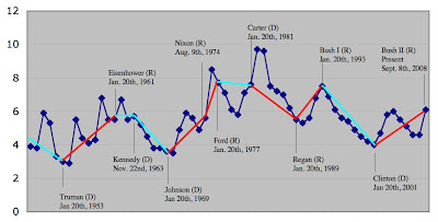
There is another way to interpret this graph that would tend to disagree with you. There is a popular maxim regarding unemployment and the economy that need to be considered
  • Actions taken by the Legislature and the President on behalf of the economy will not be felt to their fullest extent for two to five years after they have been taken.
Using this axiom, it is easy to see that Downward and Upward trends at the beginning of any president's term are most likely the results of actions taken by his predecessor, making your assumptions regarding partisan influence on employment invalid more often than they are valid, and showing the reverse is true in many (but not all) cases.
 
I'm wondering if you guys are seeing the same chart I'm seeing. The one I see has absolutely no trend based on political party. It isn't even worth dignifying with explanations because it doesn't have a trend. It also doesn't have any labels or other information to help identify that the graph is even about unemployment. It's a POS graph anybody could do with 5 minutes in Excel and another 10 minutes removing all the identifying information.

What are you seeing that is different?
 
Which graph george, there are two:confused:
 
I remarked on the first graph on post #358. Haven't seen the other one.

-dK
 
I swear I saw two posts from Rich with a graph but now I can only find one:
Unemployment.jpg


What's lacking:
1. No legend. What's red, what's dark blue, what's light blue?
2. No definition of the y axis. I'm left to believe that that is unemployment percentage in the United States.
3. No title. This could be anything.
4. The dates next to the President's name have no explanation. We are left to assume that was the last day of their presidency.
5. If the assumption is that a down trend line is light blue and an up trend line is red, why does the red trendline which I can only assume represents Reagan's time in office go down but is still red? So what magic makes Kennedy & Carter's trend lines blue while Reagan's is red?
6. Kennedy and Reagan were both president during some of the biggest financial booms in history, yet their trend lines don't indicate that.
7. New presidents inherit the good and the bad from the previous president. There is no indication of that here (though it doesn't really matter because president's have very little influence over the unemployment rate unless they create a lot of useless jobs in government).
 
I remarked on the first graph on post #358. -dK


Both the author of the graph and I used the same criteria for facts, the same as the poster that stated that Republicans encourage people to work and Democrats would rather keep people on benefits without any evidence to support the claim.

Surely your not suggesting that only one of these is flawed, guess which one keeps coming up for criticism from the Republicans:rolleyes:
 
Surely your not suggesting that only one of these is flawed, guess which one keeps coming up for criticism from the Republicans:rolleyes:

lol, not at all ... :D

I was rebuking the author of the graph and the website blog where it was located since I've seen it referred to as the defacto standard on many liberal blog sites. No disrespect to you, I am disrespecting the original author. It doesn't take conventional wisdom to note that all politicians lie, especially those "non-political" professionals that make a living calling themselves pundits and now those that call themselves journalists.

I personally prefer the line "There are lies, damned lies, and statistics", especially when it comes to government reporting. It is a known fact that every administration changes the way things are measured, there is no normalization in some semblance of utiles. Then you have biased pundits and statisticians that compute one administrations numbers based against the way another administration computed theirs without washing the data back the other way.

-dK
 

Users who are viewing this thread

Back
Top Bottom