I'm using Google's book API:
https://developers.google.com/books/docs/v1/using
Anything you see there, the app could do. Reading the thread further I see that George is also using the same API in his app and mentioned he scans the ISBN identifier, so searching for that can look like this:
https://www.googleapis.com/books/v1/volumes?q=0007322593
Try it out. As for the barcode, I've never done such a thing, but I've been following
this library for a while now, maybe I can give it a try if you're interested.
We're still discussing UI, so I personally don't think it's Off topic.
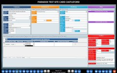
I admit I have no idea of what tools you have available to develop with PowerApps. However, if I open this thread using my smartphone and I scroll to your app's image, I see that my index finger covers too many controls to have any precision with that layout. If that's how it looks on a smartphone screen, then users have to zoom in and out to navigate that, which is a bad user experience. But it can be rearranged in many ways to adapt to a small space.
The app I deployed is one example of how you can arrange the information and place action buttons to make it interactive for a small screen, which is called "responsive" design. If you open
the app on a desktop screen and you resize the screen, you'll see how the elements shrink or expand to take different proportions, if they have space to share, they share it, if not, they take the entire screen and stack on each other in a decent way so that a smartphone user can still see the information without having to zoom. You can also choose to hide information according to the screen size, so it becomes very handy.
Here's the breakpoints that I'm using:
View attachment 111496
There are lots of UI design resources for web development, a lot of them can be used for Access.