The User Interface

To be honest I prefer to consider what the staff think they want, and then try to give them what they really need.

Where this gets tricky is that if they want to search for a "term", then you can add a search key to the table. Another way is to search every record for the search term(s) as a substring in the item name or even search the whole record, but this can be slow with a large table. Maybe you could use a Soundex to find near matches. If you knew how, which I don't you could what Google do, and gave a super fast context search.

Users would never specify some of these, I expect, but if you can give them more of what they really need, rather than what the are currently used to it can be a great help.

How did Unix achieve a "grep" out of interest? However generally we need searches to retrieve records from the sea of data.
 
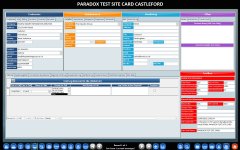
Did a small database way back in 2006; even uses the legacy switchboard. Quickly grew to the point where it needed rebuilding from new. The customer always required something adding ad-hoc to which there is only so many tabs you can use lol. It worked will for their requirement and is still being used today.. Must have done something right...
 

Attachments

  • 130622_212604.jpg
    130622_212604.jpg
    561.3 KB · Views: 143
Did a small database way back in 2006; even uses the legacy switchboard. Quickly grew to the point where it needed rebuilding from new. The customer always required something adding ad-hoc to which there is only so many tabs you can use lol. It worked will for their requirement and is still being used today.. Must have done something right...
MTBF. Mean time between failure.
I like to think my stuff does well on that, as well.
 
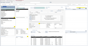
Here is the Comm Center Form. It's about to get merged with the Attachments Form.

The list boxes on the left had side are the filters for Customer/Project/Task/Comm filters.
The same filter will be used to add attachments to any entire right hand side will either be a tab control or a subform either way reusing the filters on the left.
The yellow "?" buttons are for features that need updating but not yet.

1705617514787.png
 

Attachments

  • 1705616049962.png
    1705616049962.png
    381.7 KB · Views: 121
  • 1705617451461.png
    1705617451461.png
    442.9 KB · Views: 115
Last edited:
How do you determine the balance between too much info on one screen, and too much popup opening?

I interpreted this a bit different than other early responders, I figure you know how the process of designing an app works, but are more wondering what the philosophical approach is to things - details that the end users probably don't tell you, and frankly, in many cases shouldn't, because they don't know what will work best or what design components/capabilities you are working with.

I would say I would lean a bit toward the screen containing a lot of information. The ability to see a 'next layer' of detail, and the ability to Edit that information, would both be more likely popups.

For example, there may be a drop down, Select Client. With an Edit pencil to add or edit Clients which would become a popup, then requery the combobox when popup's business is finished.
Another example, there may be a summary: "18 New Applications Waiting". A Details link would open those details.

Etc.
 
I don't know if this will make sense in your context, but for my craziest project, I didn't have ANY data on the screen until someone clicked an action button that suggested what they were planning to do. I then would enable and/or make visible a bunch of related controls needed for the function in question. And NOTHING ELSE would be on the screen at the time. Then when the function was completed, the related controls vanished again, leaving only the list of action buttons. Sort of a "minimalist" viewpoint.
 
TL;DR I avoid dense to favor workflow. Popups are no problem here.

We are at the end of the year 2023 and ALL of my users use smartphones. Therefore, all of my users are more familiar with the web standard than the windows forms standard.

When I open a smartphone app, what I see is simplicity and lots of feedback, so I apply those two concepts into my designs. In doing that, I don't have to provide training to my users, because it's intuitive for them. They often say "Oh, it's like whatsapp", "Oh, like sending an email, right?", "This looks like the app of my bank", etc.

Things that made sense in 1995 don't make sense in 2023. My users obviously don't want to use paper for data entry, so I design forms that take advantage of the computer medium, instead of making them look like paper forms. They're no longer used to paper forms anyway, so I won't bring back ancient solutions when there are objectively better options. So, instead of dense forms, I design workflows.

If you want to know what I mean, I will share with you my inspiration app, this entire site is amazingly well detailed and it will surely give you some great inspiration:
https://experience.sap.com/fiori-design-web/when-to-use-which-floorplan/

Here's a few screenshots:
View attachment 111470 View attachment 111471 View attachment 111472

Also look at the many other design principles used in that app:
https://experience.sap.com/fiori-design-web/action-placement/
View attachment 111473View attachment 111474

Or this, which is a workflow I love applying because my users understand it so easily:
https://experience.sap.com/fiori-design-web/navigation/

View attachment 111475

Navigate that site, it's incredible. I have another one, from a UI framework I use for web apps, here's a few links and screenshots:
https://ant.design/docs/spec/navigation
View attachment 111477
https://ant.design/docs/spec/proximity
View attachment 111476

Make sure to browse the other categories, they give amazing insights about form design.

Most of these things can be applied to Access.
I absolutely love this post for the things that it said about what users are already used to and therefore what you know will be more intuitive for them versus less intuitive. And I agree that the two things that the general public is most familiar with are web pages and smartphone apps, therefore whatever intuition they are trained for in those environments can also be often assumed in the access environment.

For me personally this means immediately doing the necessary actions to prohibit access from overly or over aggressively auto saving everything at the slightest touch. But that's just my personal way of applying the concept -- my MAIN point here, is that I like the concept.

Users don't care or know what is normal for Microsoft access and neither do I when I'm developing it. I only know and care what the user's expectations are because the closer I can come to meeting their expectations that goes a long way toward what they will consider a functional app.
 
Some people prefer "webby" designs and others don't. This is a data collection focused app. Forcing people through multiple screens to complete a record seems to me, at any rate, to be less user friendly. To me, that's the wrong approach for rapid data collection.

You make a good point. For apps or screens that are heavily focused on intensive data entry, it's all about stuff like setting the focus in intuitive places and moments, as well as partially validating stuff as it's being typed in and not waiting till the end. Prefilling where possible making intuitive suggestions where possible.
 
For me personally this means immediately doing the necessary actions to prohibit access from overly or over aggressively auto saving everything at the slightest touch.
Indeed, users really don't want to deal with that behavior when the standard is being able to choose to save.
 
I don't know if this will make sense in your context, but for my craziest project, I didn't have ANY data on the screen until someone clicked an action button that suggested what they were planning to do. I then would enable and/or make visible a bunch of related controls needed for the function in question. And NOTHING ELSE would be on the screen at the time. Then when the function was completed, the related controls vanished again, leaving only the list of action buttons. Sort of a "minimalist" viewpoint.
If you want to go down this road, my presentation about Task Driven Development may be useful.
 
Indeed, users really don't want to deal with that behavior when the standard is being able to choose to save.

Except for standard, you can often read old fashioned.

Users might think they need a search key field to find a customer, for instance, because that's what old systems used to do, but what they really want is a better search tool. So give them a better search tool.
 
Except for standard, you can often read old fashioned.

Users might think they need a search key field to find a customer, for instance, because that's what old systems used to do, but what they really want is a better search tool. So give them a better search tool.
What's better than key word searches?
 
What's better than key word searches?
Multiple partial string searches.

For instance, for a customer or product we used to have a short name alternative to the full name

We then changed that that to allowing up to 3 short substrings from the full name, which was much easier to use and worked better.

But if you hadn't seen the second way, you might think the first way was what you wanted, if you were asked what you wanted as a user.
How does that work?
 
How does that work?
Maybe it depends on how many items you need to search.

If you have a file with 500 products, then it may be enough to use a partial name entry, starting from the last (combobox) or search for a single substring in each record.

With a slightly bigger file size, it's easy for a user to enter "steel screw 8" and get a manageable number of products to pick from. Otherwise you end up needing a complicated system of cascading filters, which still might be awkward to use.

In the UK I tend to give up very quickly when searching for clothing from most large retailers.

I find eBay much more useable than Amazon. Amazon seems to make it very hard to return true matches, to me. It doesn't really help when your search returns 12000 results.

Maybe Amazon and eBay get their sellers to give their products multiple tags, and your search finds products where all your tags work. It's difficult if you want to find a ring in size P, say, as searching for P as a substring won't work. Not all domains use size letters. You try to find candidate 9 carat yellow gold rings with no stone, in size P or P.5, and see how many false matches you get.

But not every product has a size that is a single letter. Clothes sizes don't work like that. You even have multiple different size charts for clothes.

For my projects, allowing up to 3 substrings worked well enough to reduce the full list to a manageable size.

There's a difference between the way you manage an accounts receivable file with 1000 sales accounts, compared with an accounts receivable file for a business with hundreds of thousands of customers. In the latter case you probably don't ever want to see a full listing. What value is a 1000 page report. You have to manage everything by considering exceptions instead.
 
I also find it impossible to search Amazon for clothing. You'd think boot cut jeans would limit my jean selection to not include any skinny, strait, or wide leg variations but it doesn't. Neither does looking for specific sizes or colors or material.
There's a difference between the way you manage an accounts receivable file with 1000 sales accounts, compared with an accounts receivable file for a business with hundreds of thousands of customers. In the latter case you probably don't ever want to see a full listing. What value is a 1000 page report. You have to manage everything by considering exceptions instead.

Given that most of my applications either start out with SQL Server BE's or could potentially be upsized, I always design them with good client/server techniques from the beginning. That means that forms are always bound to queries that use selection criteria. For most forms, the criteria is limited to 3-4 fields tops. In that case, I put the search options directly on the form and add a find button which simply does a requery. For situations with more complex search options, I use a more complex search form. The search form then opens the edit form if only one row will be returned from the query or it opens an intermediary list form which can be further filtered if necessary. Then from the list form, double click opens the edit form to a single record.
 
The one technique that I sometimes find workable is to find the 'amazon Store' of a certain brand. I.E., I like Carhart heavyweight tshirts, and fortunately they have an Amazon Store for their own brand so that is helpful. Also Wranger I think has one, which yields many reasonable shirts and shorts.
 
Most ladies clothing is custom branded so even though multiple stores might carry Jeans made by xyz company,they are called My Jeans in one store and Sue's Jeans in another.
 
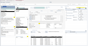
The part under the Yellow Section is for navigation and filtering. It manages entities like customers/project/task/ contacts etc.
The Blue Section manages contacting people.
The Yellow Section is useful for more than just filtering communications.
Here is the question.
1. Would you make a subform for the Yellow Section and use it in other main forms?
2. Make subform of the part under Blue Section and use different subforms on this Main Form
3. Both
4. Just add a tab control to the Blue Section
Edit: After writing this out. I've decided that I would probably go with option 2. This will allow quicker switching back and forth between various operations in the Blue Section while keeping the same selection in the Yellow.
1709219728984.png
 
Last edited:
Also, although I also prefer dense forms, I NEVER design an interface where the forms are embedded on a menu. As the others have shown, that just gets too difficult to change as features get added. I do use tabs when the data isn't related and doesn't need to be viewed in relationship to other subforms. Then I use popups when both forms need to be visible.
 

Users who are viewing this thread

Back
Top Bottom